 This is an unclassed choropleth map of Nebraska depicting median housing value.
Saturday, December 6, 2008
unclassed choropleth map
This is an unclassed choropleth map of Nebraska depicting median housing value.
Bivariate Choropleth map
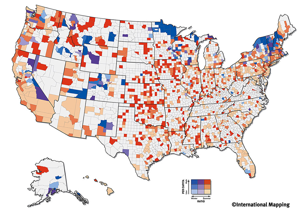 This is Bivariate choropleth map showing the ratio and capital of olympic athletes in the USA.
Standardized choropleth map

This is a standardized choropleth map showing the population density of the United States. The eastern states have the highest population density. The western and mid-western states have the least population density.
Nominal area choropleth map
 This is nominal area choropleth map of the USA 2008 Election. The data show that the Democrats win most of the state vote and the presidental election.
Statistical map

This statistical map of Napoleon’s Russian campaign of 1812 show the size of Napoleon’s army width of the lines of defence advance (green) and retreat (gold).
Isolin map
 this is a Isoline map showing the natural conditions in which water transfer to different region in the Mongolia mountains.
Proportional map
 This is a proportional map showing the location and position of football players an a football field.
Dot distribution map
 This dot distribution map shows population concentrations of the world but can give the impression that some areas of the world have no people.
Propaganda map

This propaganda Maps of the world provide powerful images. This map allow people who want to change the way we think about the world to do so.
Friday, December 5, 2008
Hypsometric map

This Hypsometric map is guide the to carry out the Brazilian electric system expansion plan.
Cadastral map
 This is a Cadastral Maps of Delaware County USA showing locations of different district.
Thematic maps
 Thematic map using pie charts showing Violent Crimes in the USA. It showing fluctuations and divisions by state between 1978 and 1998.
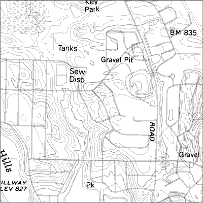
Topographic map
 The portion of this topographic map showing both karst and man made features of the Hahatonka area in the county of Camdon, Missouri.
 Cartographic animations map

This is a Cartographic animations mapping of mortality by cancer statistic in the state of Nebraska
Infrared aerial photo
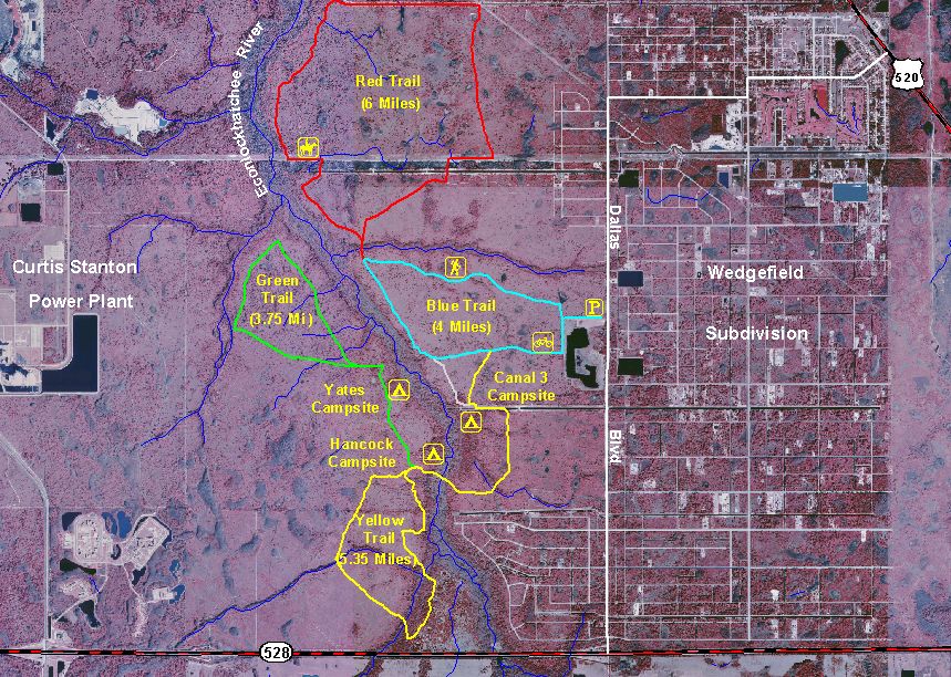
This is a Infrared aerial photo taking in 2000 of Hal Scott showing hiking trails, camp sites and roads.
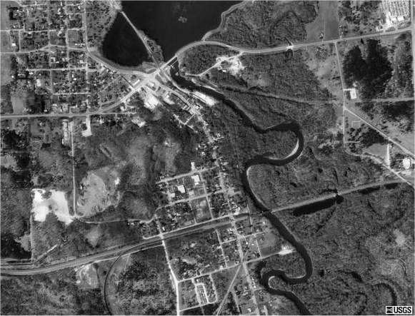
Black and white aerial photo
 This black & white aerial composite print shows the entire Iow a Great Lakes area in the past years.


Thursday, December 4, 2008
Isopleths map
 This Isopleth map shows the Hydrogen Ion concentration in the United States. It conclude that there is more Hydrogen Ion concentration in the western part of the United States.

Isohyets map

The typical mean annual rainfall across the State is depicted in this image . Temporal variations in rainfall also occur throughout the year, resulting in dry summer periods.
Isotachs map
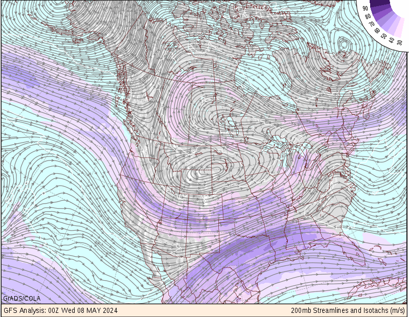
This Isotachs map is use to analysis issued by the National Centers for Environmental Prediction.
LIDAR map
 This is an airborne LIDAR system for the acquisition of digital elevation models. It comprises an on-board sensor system (hardware) and a modular software package to process acquired data.
DEM map
 This Digital Elevation Model (DEM) map is indicating the location of the Rockwell Science Center.
DOQQ map
This DOQQ images are corrected for optical distortions in the Earth's surface to correspond with true positions on the ground.
Wednesday, December 3, 2008
Isobars map
 This isobars is describing the horizontal change in pressure accross the unite state of America.
Regions of high and low atmospheric pressure develop at the earth's surface for a variety of reasons, including heating or cooling, and the rising or sinking of air which causes changes in air presure levels.
Accumulative line graph or Lorenz curve
 Accumulative line graphs show how a metric adds up to a total over a period of time. This type of graph is typically used to show a trader's equity curve with respect to cumulative P/L, but is also useful in showing patterns of accelerated occurances of risk, amongst other metrics.
Index value plot
 This index value plot is explaning and showing the steamflow conditions each day from the year 1999 to 2008.
 Scatterplot map
 This is a sctterplot map showing the age of husband and wife. Both husband and wife are about the same age. As the husband increase in age the wife's also get older.
Population profile map
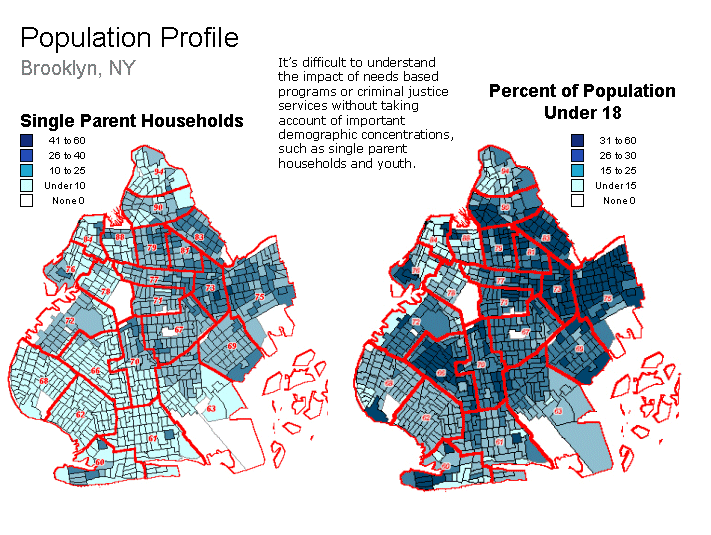 This population profile map is showing and compearing the population of singl parents households and the population of households under the age of 18 in brooklyn New York
Climograph map
 This climograph map is demonstrating the tropical moonson climate in Mongloria India, Coastal areas of southwest India, Sri Lanka, Bangladesh, Mynamar (Burma), Southwestern Africa, French Guiana and northeast and southeast Brazil.
Windrose map
 This concentric circles (windrose map) in dashes of a wind rose represent the various percentage frequencies of time. The innermost full circle represents the percentage occurrence of calm wind speed.
Triangular plot map
 This is a trianguler pot map showing the texture of different soil. The soil textures defined as proportions of sand, silt and clay.
Parallel coordinate graph
Histogram map
 This histogram is showing the results of a final exam given to a class of students. Each score range is denoted by a bar of a certain color. When histogram were compared with those of classes from other years that received the same test from the same professor, conclusion were drawn about intelligence changes among students over the years.
Similarity matrix map
 This similarity matrix map is showing the representation for the reduced set of 100 structures with known protein binding data. The branches are colored according to log Kb values one with the scale ranging from blue over white to red.
Correlation map
 This correlation matrix shows the relationships between the principal bond and forex markets as well as equity regions, sectors and investing styles for which Investors RouteMap generates recommendations. Acute danger is colour-coded in red and indicated by high numbers approaching 100%. Falling danger levels are colour-coded in the red to green spectrum. Low and negative numbers colour-coded in green indicate minimal danger of correlation.
Stem and leaf plot map
 This stem and leaf map is showing how the new housing starts in the USA could be described as skewed to the right because the higher values are more spread out than the lower values.
Box plot map
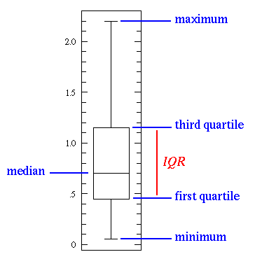 This box plot map is displying the distribution of data data based on the five number summary minimum, first quartile, median, third quartile, and maximum.
Tuesday, December 2, 2008
Star plotes
 This map is illustrating the use of reservoir oil fingerprint and showing the differents in peak ratio
Subscribe to:
Posts (Atom)